4 Products Microsoft and LinkedIn Need to Ship

An op-ed piece I wrote for VentureBeat:

Last week, Microsoft stunned the tech world with the largest ever software acquisition – the purchase of LinkedIn for $26.2 billion. While early news coverage has addressed plans to keep LinkedIn independent, there’s been little discussion about what exactly the two companies will do together. As someone who’s entrenched in the LinkedIn and Microsoft ecosystems, I thought I’d share four exciting products this acquisition makes possible:

1. Redefined business email

The quickest and broadest impact Microsoft can make with LinkedIn is to redesign its Outlook interface. The companies could easily bring LinkedIn insights, profile photos, etc. into the email experience (similar to what Rapportive offers today but with a seamless, actionable approach). Outlook could even show recent updates and thought leadership pieces from a particular profile as talking point suggestions to automatically populate in an email when selected.

Microsoft could also add automated email filtering and prioritization features with folder recommendations that improve email productivity. Imagine if you could get emails that meet certain criteria — say they come from a particular job title and are second-degree connections with at least 500 connections themselves — to stick in the top of your inbox until they receive your attention.
Read more …

Amazon, Google and Apple vs the Big 5 Unicorns on Hiring and Churn

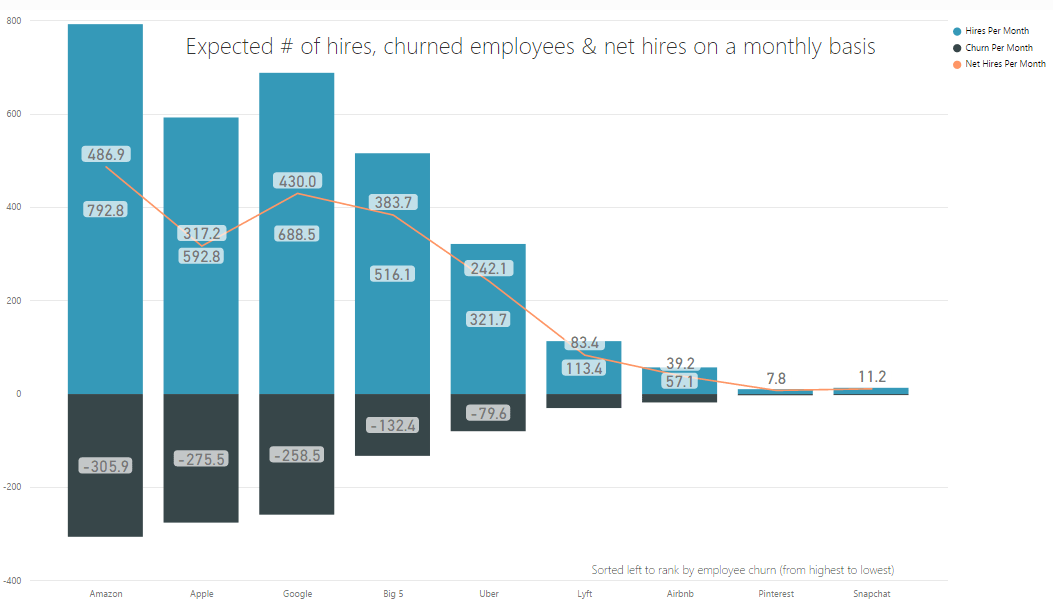
I’ve received multiple requests to analyze employee churn and new hiring rates for big companies and unicorns with the approach I took earlier for studying engineering and sales retention rates. I figured I’d give it a shot – and combine all of the key metrics in one chart …

amazon_google_apple_unicorns_retention_hiring

How to read this:

Blue bar represents the number of expected new hires that particular company will make in a 30 day (one month) period. Black bars (negative values) indicate how many employees will churn in a one month period. The orange line (the top most numerical labels correspond to the orange line plot) represent the net change in hires per month (new hires less churn). The companies are ranked by churn from left to right in descending order (so highest churn on the left).

As you can see in the chart, the big three companies included in this analysis are Amazon, Apple and Google. The unicorns are Uber, Lyft, Airbnb, Pinterest and Snapchat. “Big 5” combines these unicorns together as if they were one whole company. Also note, this is looking at employees worldwide with any job title.

Key Insights:

  1. Apple is not hiring enough new heads when compared with Amazon and Google. In fact, the Big 5 unicorns combined will hire more net heads than Apple with almost 50% less employee churn.
  2. Amazon’s churn is the highest – losing a little over 10 people a day. However, this is not bad relatively speaking – Google loses 8-9 people a day, and Apple is a tad over 9 a day (and Amazon has 36% more employees than Google). Given the recent press bashing Amazon’s culture and the periodic press envying Google’s great benefits, their retention rates tell a different a story – that it’s closer to a wash. Big tech companies with great talent churn people at pretty similar high rates regardless it seems (have some more thoughts on this but will save those for another post).
  3. At these current rates, all of the companies here (collectively) will increase their employee size by 20K (19, 414 to be precise) heads by year end (this is new hires less churn). That’s a measly 5% increase in their current collective employee size – and this is across the Big 3 Tech Companies and Big 5 Unicorns.
  4. Let’s compare Amazon to the Big 5 Unicorns. The Big 5 will hire 79% as many incremental heads as Amazon in a month, even though their collective employee size is 24% that of Amazon’s. Amazon has been in business for much longer (2-3x days since incorporation), and the Big 5’s churn is 43% of Amazon’s figure – both factors contributing to the closeness in the incremental head rate between the two.

Want more details?

How did I calculate these figures? Take a look at my previous post on engineering retention for more details. Same caveats listed there apply here, and then some (such as how this depends on the participation rates of LinkedIn which may differ considerably internationally compared to the US market which my previous posts exclusively focused on). Feel free to connect or email me if you have any questions or feedback.


Ranking Companies on Sales Culture & Retention

A company’s sales retention rate is a very important indicator of business health. If you have a good gauge on this, you could better answer questions such as: should I join that company’s sales department, will I be able to progress up the ladder, are reps hitting their numbers, are they providing effective training, should I invest money in this business, etc. But how does one measure this rate especially from an outside vantage point? This is where LinkedIn comes to the rescue. I essentially cross applied the approach I took to measuring engineering retention to sales.

sales_ret_2

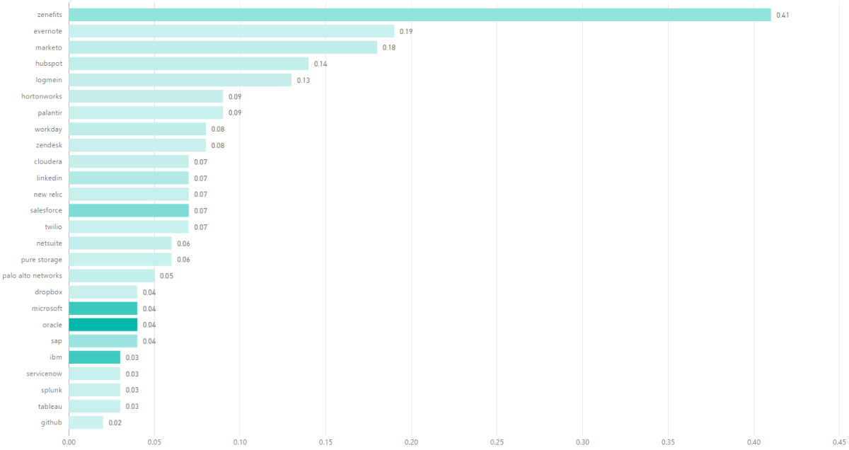
This chart reveals several key technology companies ranked in reverse order of sales churn – so higher on the chart (or longer the bar) the higher the churn (so from worst at the top to best at the bottom).

So how are we defining sales churn here? I calculated the measurement as follows: I took the number of people who have ever churned in a sales role from the company and divide that by the number of days since incorporation for that respective company (call this Churn Per Day), and then I compute the ratio of how many sales people will churn in one year (the run rate i.e. Churn Per Day * 365) over the number of current sales people employed.

For ex. if you look at the top row, which is Zenefits, the value is 0.40 – which means that 40% of the current sales team size will churn in a one year period. In order to maintain that sales team size and corresponding revenue, the company will need to hire 40% of their team – and sooner than in a year as that churn likely spreads throughout the year as well as given new sales hire ramping periods (if you’re churning a ramped rep and say it takes one quarter to ramp a new sales rep, then you need to hire a new head at least one quarter beforehand to avoid a revenue dip).

A few more notes:

The color saturation indicates Churn Per Day – the darker the color, the higher the Churn Per Day.

Caveats listed in the previous post on engineering retention apply to this analysis too.

How LinkedIn Could Take On Salesforce

An op-ed I wrote for TechCrunch:

Today’s B2B sales and marketing folks struggle with the overwhelming number of channels for finding and reaching new leads. The customer “funnel” continues to expand as buyers do more of their own research before raising their hand to connect with a sales rep. But imagine if you could make the funnel taller by identifying leads when they’re just browsing your site and haven’t yet filled out your “contact me” form, or leads who haven’t yet visited but are likely to be a good fit for your product? That’s hard to do with the primitive tools that are available for sales and marketers today, unless you bring together some very rare assets – which just so happen to all exist at LinkedIn.

LinkedIn is the only company with fairly clean, accurate details on pretty much every contact that matters in the business world (unfortunately, most other data providers’ contact info contains 80% garbage, and they can’t really improve it without violating CAN-SPAM laws). LinkedIn also reflects the direction sales is heading with strong channels for thought leadership. Via LinkedIn, you can educate and advocate for your customers vs. just selling to them.

Read More …

Ranking High Schools Based On Outcomes

High school is arguably the most important phase of your education. Some families will move just to be in the district of the best ranked high school in the area. However, the factors that these rankings are based on, such as test scores, tuition amount, average class size, teacher to student ratio, location, etc. do not measure key outcomes such as what colleges or jobs the students get into.

Unfortunately, measuring outcomes is tough – there’s no data source that I know of that describes how all past high school students ended up. However, I thought it would be a fun experiment to approximate using LinkedIn data. I took eight top high schools in the Bay Area (see the table below) and ran a whole bunch of advanced LinkedIn search queries to find graduates from these high schools while also counting up their key outcomes like what colleges they graduated from, what companies they went on to work for, what industries are they in, what job titles have they earned, etc.

The results are quite interesting. Here are a few statistics:

College Statistics

  • The top 5 high schools that have the largest share of users going to top private schools (Ivy League’s + Stanford + Caltech + MIT) are (1) Harker (2) Gunn (3) Saratoga (4) Lynbrook (5) Bellarmine.
  • The top 5 high schools that have the largest share of users going to the top 3 UC’s (Berkeley, LA, San Diego) are (1) Mission (2) Gunn (3) Saratoga (4) Lynbrook (5) Leland.
  • Although Harker has the highest share of users going to top privates (30%), their share of users going to the top UC’s is below average. It’s worth nothing that Harker’s tuition is the highest at $36K a year.
  • Bellarmine, an all men’s high school with tuition of $15K a year, is below average in its share of users going on to top private universities as well as to the UC system.
  • Gunn has the highest share of users (11%) going on to Stanford. That’s more than 2x the second place high school (Harker).
  • Mission has the highest share of users (31%) going to the top 3 UC’s and to UC Berkeley alone (14%).

Career Statistics

  • In rank order (1) Saratoga (2) Bellarmine (3) Leland have the biggest share of users which hold job titles that allude to leadership positions (CEO, VP, Manager, etc.).
  • The highest share of lawyers come from (1) Bellarmine (2) Lynbrook (3) Leland. Gunn has 0 lawyers and Harker is second lowest at 6%.
  • Saratoga has the best overall balance of users in each industry (median share of users).
  • Hardware is fading – 5 schools (Leland, Gunn,  Harker, Mission, Lynbrook) have zero users in this industry.
  • Harker has the highest share of its users in the Internet, Financial, and Medical industries.
  • Harker has the lowest percentage of Engineers and below average share of users in the Software industry.
  • Gunn has the highest share of users in the Software and Media industries.
  • Harker high school is relatively new (formed in 1998), so its graduates are still early in the workforce. Leadership takes time to earn, so the leadership statistic is unfairly biased against Harker.

You can see all the stats I collected in the table below. Keep in mind that percentages correspond to the share of users from the high school that match that column’s criteria. Yellow highlights correspond to the best score; blue shaded boxes correspond to scores that are above average. There are quite a few caveats which I’ll note in more detail later, so take these results with a grain of salt. However, as someone who grew up in the Bay Area his whole life, I will say that many of these results make sense to me.